So you have a website for your dental practice. Is it doing its job the best it can be for your practice? Here are six best practices from an expert so that your efforts are not in vain.
I’ve written about the most important pages on a dental website. Here I’ll look at six best practices you can apply to your own practice website. You’ll learn how to engage with new visitors (including potential patients), how to actively encourage website visitors to take action, and much more.
1. Mobile-friendly design is not optional!
Does your website look great on all devices, from phones to tablets to desktops? Modern websites should feature responsive design. A responsive website responds to the size of the device accessing it and adjusts the layout and design accordingly.
In our experience working with dentists throughout the country, as much as 70% of website traffic comes from mobile devices. Mobile visitors are valuable.They’re often far along in their research of dental practices and close to reaching out for an appointment. Don’t miss out on their business!
What do mobile visitors expect?
- Pages must load fast—Even a fraction of a second delay can cause visitors to leave your site. Compress images and take advantage of mobile site testing tools to learn how to speed up your site.
- Easy to navigate—Make sure buttons and touch targets are large enough to tap easily.
- Optimized for their screen size—Use text big enough to read, and place the most important content, including contact information, at the top of the page.
2. Encourage website visitors to take action
Your dental practice’s website has two primary audiences:
• Your current patients—This audience is generally looking for contact information, your practice’s hours, printable forms, and more. • People who may become patients—This audience needs to learn about your practice, services, approach to billing, and more.
Your website should actively encourage all visitors to take an action. The actions they take should help them reach their goals.
Examples of these “calls to action” include:
• Buttons—Buttons stand out and encourage clicks. The text on a button should be short and clear. For example, “Get in touch” or “Schedule an appointment.”
• Forms—Your website’s contact form or newsletter sign-up form are also calls to action. Encourage visitors to fill them out by clearly explaining the value they’ll receive.
• Phone calls—A phone call to your office is a very valuable action. It’s a chance for your front desk staff to provide great service to both potential and current patients.
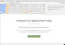
As a best practice, every page should have at least two calls-to-action, excluding links to other pages.For example, your home page can encourage potential patients to call your office (your primary call to action) or click a button tolearn more about your services (your secondary call to action).
3. Include essential information on your contact page
Make it easy for someone wants to contact your dental practice. Build a contact page with all the information a visitor could need, such as driving directions, hours of operation, and your phone number.
You should also include a contact form. Many practices integrate their contact forms with their practice management software. Require only essential information, such as name, email address, phone number, and space for a short message.
Only ask for additional information if it’s absolutely necessary. The longer it takes to fill out a form, the less likely a website visitor will use it.
4. Get the SEO basics right
Search Engine Optimization (SEO) is anything you do to improve your practice’s rankings on Google, Yahoo, Bing, etc. SEO is very complex and changing constantly. There are entire books written about dental SEO. There isn’t room in this article to explain all of the fine points. Instead, let’s focus on avoiding the mistakes many dental practices make and getting the basics of SEO correct.
1. Include a meta title (70 characters or less) and a meta description (155 characters or less) on every page.
2. Give every page a relevant title. The first bit of text on the page is part of what search engines use to determine how relevant a page is for a given search. For example, if a person searches for “teeth whitening in Seattle,” a page with the title “teeth whitening Seattle”will be more relevant than one just called “teeth whitening.”
3. Use simple, uncomplicated URLs. The URL is more commonly known as the web address.
Bad examples
• http://mydentalpractice.com/rtCanls—Don’t abbreviate, misspell, or use nonsense words.
• http://mydentalpractice.com/rootcanals—Don’t run words together.
• http://mydentalpractice.com/root_canals—Don’t use underscores to separate words.
Good examples
• http://mydentalpractice.com/root-canals—Use hyphens to separate words.
• http://mydentalpractice.com/mercury-free-fillings—When appropriate, include extra information and be specific in your URLs.
4. Never change URLs. This can confuse search engines and lead to broken links on your website and on other sites linking back to your site.
5. Your website’s footer matters
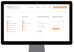
In web design lingo, the footer is the area at the bottom of your webpages. In most cases, the footer will be exactly the same on every page throughout your site. It might include links to your most important site pages, contact information such as business name, address, and phone number, links to your social profiles such as Facebook and Twitter, and a newsletter sign-up form.
6. Create useful content
When it comes to dental websites and dental marketing, there’s one word thrown around all the time—content. Content is anything you show your visitors. It could be a blog post, an informational article about oral health care, a video you made showing off your newly remodeled office, pictures of your staff—anything.
Your goal should be to regularly produce compelling, engaging, creative, and useful content. Here are a few ideas to get you started:
- Create a short video about new dental products that you’re excited about.
- Share testimonials from your most satisfied patients, with pictures.
- Use videos to show your office’s amenities, waiting room, and treatment areas.
- Encourage hygienists and front office staff to contribute to your blog with their experiences and expertise.
What’s the point of all this content? Content keeps website visitors engaged and helps them connect with your practice. By including calls to action in your creative and compelling content, you will get visitors to take action.
Where to go from here?
It’s up to you to find opportunities to apply these best practices to your dental website. Read my previous DentistryIQ articles for examples of the most important pages on a dental website, or to learn how to turn innovative marketing campaigns into content you can use on your website. If you read something that interests you, connect with me on LinkedIn.


