October 24, 2012
Updated July 24, 2018
View more beautiful and updated offices in the new Dental Economics Design Studio section here.
Check out these unique dental offices on DentistryIQ.
Surf’s up! At your dental visit? Check out this beach-themed office
Historic building restored for the dental offices of Dental Associates in Milwaukee
Dental office design, reborn in Portland
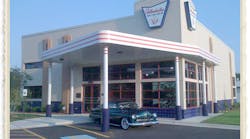
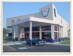
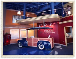
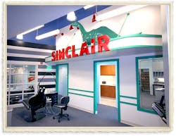
As Dr. David Myers started thinking about a new office, a developer in town announced they were incorporating an old gas station from the 40s into a new space in town. Dr. Myers then developed an idea that would be realized just three years later. DJM Orthodontics in Conway, Arkansas doesn’t look like your run-of-the-mill orthodontics office. Using his interests in rebuilding old cars and collecting what he calls “junk,” Dr. Myers created an office that was both personal and welcoming – not to mention interesting enough that patients might be able to forget about having braces on their teeth for just a little bit. Dr. Myers was pleased with the end result: “We were able to complete the entire project as you see it for the same cost as building a traditional ‘boring’ dental office in beige.” To see more pictures and read about the process, check out this blog post written by Dr. Myers.
DJM Orthodontics
Conway, Arkansas
Firm: Green Curve Design
Photo source
Like the idea of creating a one-of-a-kind dental office for you and your patients? Here are nine more examples of doctors who went above and beyond with their office design.
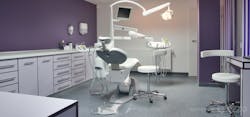
Royal Dental
Bucharest, Romania
Design: ezzo
Photo source
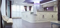
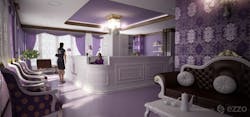
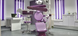
Let’s hope patients of Royal Dental like the color purple.
bloō dental
Ashburn, Virginia
Firm: Forma Design
Photo source
It’s no wonder that, on his practice website, Dr. Haress Rahim lists scuba diving as one of his hobbies. The theme for many of these offices is a reflection of the dentist’s personal interests outside of the office. Can you guess what Dr. Rahim’s favorite color is? Taken from the dictionary pronunciation of the word “blue,” the use of the phonetic spelling of the word to name his office also reflects Dr. Rahim’s interest in reading.
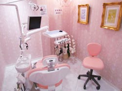
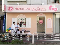
Oh! Hello, kitty. I know the design for all of these is to make the patient feel more comfortable, but honestly, I’m terrified of all the pink.
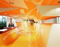
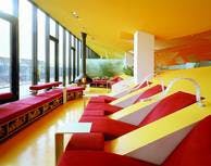
KU64
Berlin
Firm: GRAFT
Photo source
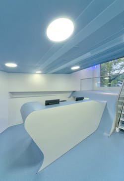
KU64, designed for Dr. Stephan Ziegler, might look more like a trendy, upscale hotel lobby than a dentist’s office, and Dr. Ziegler will assure you that that is the point exactly. As he stated in an interview with the German website blend-a-med, patients will never smell that off-setting “dental” smell in his office. Instead, they may smell brewed coffee or even lemongrass, which he uses for aromatherapy. Combine that with the views of Berlin from his office windows, and patients are sure to experience a pleasant atmosphere where they least expected.
Minami-Nagano Dental Clinic and Residence
Tokyo
Design: Hiroki Tanabe
Photo source
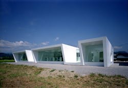
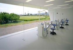
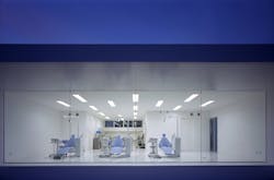
Apparently a dental clinic and resident of the practicing dentist, the Minami-Nagano Dental Clinic is situated in the suburbs of Tokyo in a farming village. The building features glass panels as the walls of the building, as well as expansive skylights above to create an effect of being outside. It is reiterated on the designer’s page that the clinic and the residence are separate, in accordance with Japanese laws.
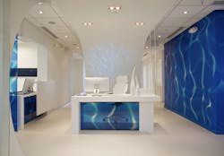
Kinderdentist
Berlin
Firm: GRAFT
Photo source
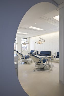
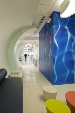
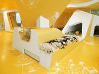
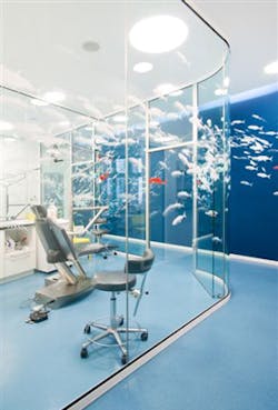
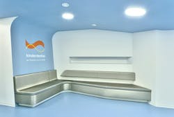
The goal of the Kinderdentist office design was to create the feeling of an underwater world. Besides the occasional orange accent as part of their logo (and a recurring theme), the sole colors of the office are aquatic – mostly blues and silvers. Dr. Mokabberi and his partners in dentistry wanted to create a different feeling for their office. They didn’t like the white-walled sterility of a typical dentist office, so they went aquatic.
Dentistry for Kids
Wilsonville, Oregon
Photo source
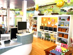
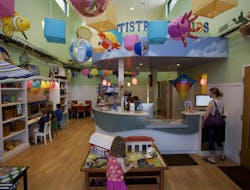
Dentistry for Kids is awesome. The waiting room looks like a kindergarten teacher’s ideal classroom.
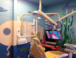
Kids can watch The Little Mermaid in the dentist’s chair. There are different themes for each exam room, including an under-the-sea theme, a jungle theme, and a flight theme (the room is decorated with “floating” hot air balloons and airplanes). Honestly, I would love to watch The Little Mermaid while in the dentist’s chair. 10 points to Dr. Dustin James!
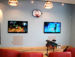
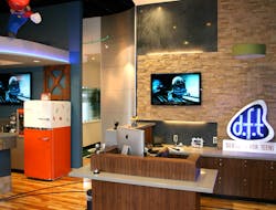
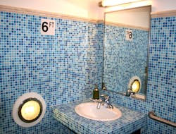
Dr. Dustin even has a separate area for those patients who may still be considered “pediatric,” but have outgrown the younger setting. Dentistry for Teens has a basketball court floor, a 50s-style milkshake bar, and Rock Band, along with teen favorites like music, games, and popcorn (but is that a good idea before a dentist appointment?). Oh – and a bathroom that looks like you’re underwater in a pool.
Children's Dental Care
Savage, Minnesota
Firm: James A. Strapko
Source
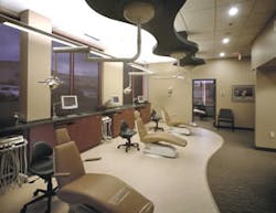
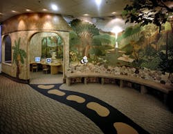
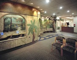
These dentists (Dr. George Hankerson, Dr. Brent Kvittem, and Dr. Amy Kebriaei) decided to go for a jungle theme that would appeal to their young pediatric patients as well as to their teen patients. Pretty cool.
Dental Clinic
Torres Vedras, Portugal
Firm: MMV Arquitecto
Photo source
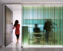
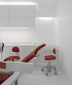
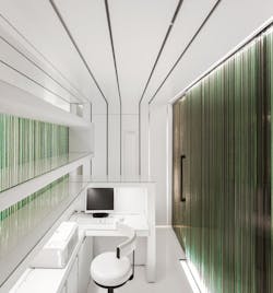
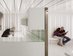
The designers of this clinic, inspired by the look of a block of ice, created a dental office that looks as pristine as it does cold. But hey – that’s ice.
If you are feeling inspired by these offices, I suggest reading this article from Health Care Design Magazine on Why Good Design is Good Business. And if you're interested in redesigning your office, take a look at the 2012 Dental Office Design Competition winners.
